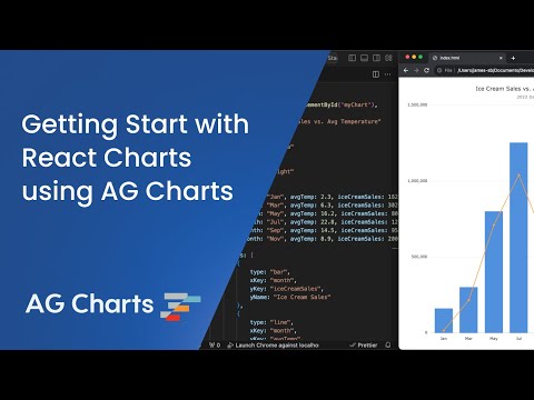
Learn the key concepts of AG Charts by building a basic combination chart and applying styling & formatting
Overview Copy Link
In this tutorial you will:
- Create a Simple Bar chart
- Add an additional Line Series to the Bar Series
- Style the chart with Themes, titles, Legend, and formatted data
- Format the axes
By the end of this tutorial, you will have a Line and Bar combination chart, with a Legend, title and formatted values. Try it out for yourself by hovering elements to display tooltips, or toggling series visibility by clicking the Legend elements in the example below.
Chart Basics Copy Link
Complete our Quick Start (or open the example below in Plunker) to start with a basic chart, comprised of:
- Chart Options: Object which contains the chart configuration options, including data, and series properties:
- Data: The data to display within a chart (typically an array of data-points).
- Series: The type of chart to display, and the data to use. For cartesian charts, a minimum of three properties are required:
- Type: Defines the type of chart to display (e.g. Line, Bar, etc.).
- xKey: The data to use for the X axis.
- yKey: The data to use for the Y axis.
Putting these things together creates a basic chart.
Combination Charts Copy Link
A chart can have more than one series, which can be useful when comparing datasets. To add another series to the chart, simply add another object to the series array, referencing the data to use.
const [chartOptions, setChartOptions] = useState({
    series: [
        { type: 'bar', xKey: 'month', yKey: 'iceCreamSales' }, // Existing 'Bar' Series, using 'iceCreamSales' data-points
        { type: 'line', xKey: 'month', yKey: 'avgTemp' }, // Additional 'Line' Series, using 'avgTemp' data-points
    ],
    // ...
});
Running the chart at this point will show the two series in the same chart.
Configuring Secondary Axes Copy Link
The chart above shows both series in a single chart, but given that the data-sets are quite different, it would make more sense to have a secondary axis for the second series.
To do this, first we need to link each series to the appropriate axis using the yKeyAxis property on the series:
const [chartOptions, setChartOptions] = useState({
    series: [
        {
            type: 'bar',
            xKey: 'month',
            yKey: 'iceCreamSales',
            // Y Axis Key, to link series to an axis
            yKeyAxis: 'priceAxis',
        },
        {
            type: 'line',
            xKey: 'month',
            yKey: 'avgTemp',
            // Y Axis Key, to link series to an axis
            yKeyAxis: 'temperatureAxis',
        },
    ],
    // ...
});
The yKeyAxis property provides a way to reference a series from the axis configuration. To configure the axes, we need to add the axes property to the chart options, defining each axis and linking it to the appropriate series using the same keys defined in the yKeyAxis properties above:
const [chartOptions, setChartOptions] = useState({
    axes: {
        // Use left axis for 'iceCreamSales' series
        priceAxis: {
            type: 'number',
            position: 'left',
        },
        // Use right axis for 'avgTemp' series
        temperatureAxis: {
            type: 'number',
            position: 'right',
        },
    },
    // ...
});
Let's breakdown what's happening here:
axes.{key}: The key used to reference the axis, which should match theyKeyAxisproperty on the series.Type: The type of axis to use - one of Category, Number, Time or Log.Position: The position on the chart where the axis should be rendered, e.g. 'top', 'bottom', 'right' or 'left'.
Now when we run our chart, we should see both series and three axes.
Refer to our Axes Configuration docs for more information on configuring axes.
Styling Copy Link
Now we have a chart complete with multiple series and axes, the last thing to do is style the chart.
Titles Copy Link
Titles and subtitles can also be added to the chart via the title and subtitle properties.
const [chartOptions, setChartOptions] = useState({
    title: { text: 'Ice Cream Sales' },
    subtitle: { text: 'Data from 2022' },
    // ...
});
Note: Refer to the title and subtitle API docs for a full list of properties that can be configured
Legend Copy Link
You may have noticed that the chart added a Legend when we added a second series to our chart. We can configure the Legend using the legend property, including adjusting its size and position.
const [chartOptions, setChartOptions] = useState({
    legend: {
        position: 'right',
    },
    // ...
});
We should now see the Legend displayed on the right hand side of the chart, rather than underneath it.
Note: Refer to the Legend docs for more info
Renaming Series Copy Link
As you can see, our Legend and Tooltips use the property name from the data directly. We can show something more human readable by adding the yName property to our series.
const [chartOptions, setChartOptions] = useState({
    series: [
        { type: 'bar', xKey: 'month', yKey: 'iceCreamSales', yName: 'Ice Cream Sales' },
        // ...
    ],
    // ...
});
Now we should see our Legend and Tooltips using the yName value as opposed to the yKey.
Formatting Axes Copy Link
The last thing to do is format our axes labels to make the chart more readable. We can do this by using a formatter on the label property of the axis.
The formatter should be a function that receives the axis label data and returns a String to display. For example, we can format our right axis to include ' °C' with the following function:
const [chartOptions, setChartOptions] = useState({
    axes: {
        // ...
        temperatureAxis: {
            type: 'number',
            position: 'right',
            label: {
                // Label value as a formatter function
                formatter: (params) => {
                    return params.value + ' °C';
                },
            },
        },
    },
    // ...
});
Now our chart should display formatted temperature values on the right axis.
Note: Refer to the axes API docs for a full list of properties that can be configured
Test your Knowledge Copy Link
Format the left axis using
toLocaleString()Hint: Add a formatter to the
axes.{key}.labelpropertyChange the 'avgTemp' legend item label to 'Average Temperature (°C)'.
Hint: use the
yNameproperty on the 'avgTemp' series
If you're stuck, check the source code of the example.
Summary Copy Link
Congratulations, you've completed our introductory tutorial! By now, you should be familiar with a few key concepts of AG Charts:
- Chart Options: Object which contains all of the configuration options for the chart.
- Data: The data to be displayed within the chart.
- Series: Controls the chart type (series) and links it to the data. Multiple series can be used to create combination charts.
- Axes: Controls the Axes and links it to the data.
- Styling & Formatting: Controls the look and feel of the chart through formatters and series properties.