This section explains how the chart and its components are sized and laid out within the available space.
Chart Size Copy Link
The chart will auto-size by default, taking the size of the container element and auto-sizing the chart dynamically. Use the width and/or height options if a fixed size is required.
When auto-sizing, the chart will default to a minimum width and height of 300px. Set minHeight: 0 and/or minWidth: 0 to remove this constraint.
Size Changes Copy Link
The chart monitors the size of the container element, and resizes dynamically.
When the container size changes, the layout process is repeated for the new canvas space. As most chart components are a fixed size, it is usually the series-area which shrinks or grows, with the other components moving around or adjusting alignment.
Sizing the Chart Container Copy Link
A <div> element is commonly used for the container, and the default height for this element type is 0px. The chart's minimum height default will cause it to have a height of 300px.
Users should explicitly manage the browser calculated container element size to achieve the dynamic size required.
Sizing with Classes and Styles Copy Link
<div id="myChart" class="chart" style="width: 500px; height: 400px"></div>
const options = {
    container: document.getElementById('myChart'),
};

AgCharts.create(options);
In this configuration:
- The element containing the chart is sized using inline styles. It could also be sized by styling the provided class.
- All attributes on the
containerelement - includingclassandstyle- are left unchanged when callingAgCharts.create.
Sizing with Grid Layout Copy Link
<div style="display: grid; width: 100%; height: 100%;">
    <div id="myChart"></div>
</div>
In this configuration:
- The chart container is styled by placing it within a parent element using a
display: gridlayout. - In this example, the grid has a single cell. By default, grid stretches child elements to fill the width and height of the cell.
Chart Layout Calculation Copy Link

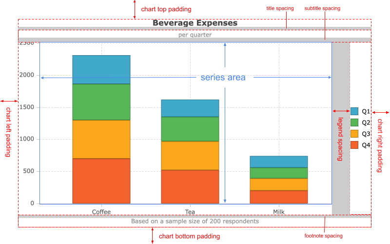
Each chart is composed of a single or multiple series, and optionally a Legend, Axes, and captions, such as title, subtitle and footnote. All of these components are managed by the chart's layout engine. They are sized and positioned appropriately based on the chart's dimensions, the nature of the data and the configuration.
Components are laid out in the following order; earlier elements take up space that is then unavailable for the layout of later elements:
- Chart padding.
- Title plus its configured spacing.
- Subtitle plus its configured spacing.
- Footnote plus its configured spacing.
- Legend plus its configured spacing.
- Toolbar.
- Range Buttons.
- Navigator plus its configured spacing.
- Series area padding.
- Axes.
- Series area.
If any elements are disabled or not used, they do not consume any space during layout processing.
Chart Padding Copy Link
padding configuration is applied first, ensuring a clear boundary of all other components from the edge of the canvas. Space is consumed on all sides of the available area based upon the padding configuration.
Title Copy Link
title configuration applies next, horizontally centring on the remaining space and consuming the height of the title and its additional title.spacing.
Subtitle Copy Link
subtitle configuration applies next, horizontally centring on the remaining space and consuming the height of the subtitle and its additional subtitle.spacing.
Footnote Copy Link
footnote configuration applies next, horizontally centring on the remaining space and consuming the height of the footnote and its additional footnote.spacing at the bottom.
Legend Copy Link
legend configuration is applied to the remaining space. The exact space consumed depends on how the Legend is configured.
legend.spacing can be used to adjust the space between the Legend and later components.
Toolbar and Range Buttons Copy Link
The Toolbar and Range Buttons are then placed next, taking up a fixed amount of space.
Navigator Copy Link
navigator configuration is applied next. The exact space consumed depends on how the Navigator is configured.
navigator.spacing can be used to adjust the space between the Navigator and later components.
Series Area Padding Copy Link
seriesArea.padding configuration is applied. It can be used to avoid the overlapping of series items with Legend, title and Axes labels.
Axes Copy Link
axes layout is then calculated based upon the remaining space and how the Axes are configured.
Series Area Copy Link
All remaining space is then dedicated to rendering of the configured series options.